Logistic Regression
Binary Classification
Another regression-type model I see. “How does this one differ from Linear Regression?” one might ask, and to them I would respond with the type of data we’re looking at. So far, all of the data we’ve used has given us a numerical output, quantitative data. We want to predict the price of something in 10 years, or figure out how much a property will cost after a given period of time. We can call these predicted values continuous. This time, what we’re going to want a response of a categorical type.
What are some things we can predict with categorical data? We can create models that determine if text messages are from spam numbers or not, see if they would like a genre of movie, or even someone’s vote in a mayoral election. The first two examples are binary classifications. The other example would be a multiclass classification, which we’ll take a look at next time. For now, let’s focus on the first.
A common example we can use is a life insurance salesperson. They’re given a dataset of people of various ages. We want to see if they’re going to purchase life insurance. With this data, you’re going to end up with a dataset that’s plotted out to look something like this;
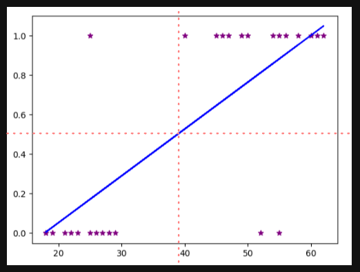
The red-dashed lines are boundaries we can use to determine the answer to my question; will the person by life insurance? We have some outliers we can ignore, but it’s doing a decent job of determining with everyone who would in the top right column, and everyone who wouldn’t in the bottom left. Another way we could say this is that everyone above a score of .5 will buy, and everyone below will not.
A problem arises if our dataset includes someone way over the age of 80 purchases some insurance. Our new linear regression model would look something like this;

Keeping our 0.5 scale, you can see many more who would have said Yes are being categorized as no. That is obviously not good, so linear regression is probably not the best model we can use.
Basically, we want to use a new shape, the sigmoid, instead of a basic linear function. The formula this time instead of $y=mx+b$ is $sigmoid(z)= ^{1}/_{1+e^{-z}}$ , where $e$ is known as Euler’s number or 2.71828… The output of this will be a number between 0 and 1. If we’re really going into the math of it, we’re actually going to replace the $-z$ of the sigmoid function into $mx+b$, so it really looks like this; $y = \frac{1}{1+e^{-(m*x+b)}}$.
Let’s hop into the Python code that will abstract away all of the scary math and just let us predict some values. We start as always, importing whatever libraries we’re going to use. We have one new one; LogisticRegression. Because I want you to actually see the Linear Regression fail in real time, let’s bring in that model as well;
import numpy as np
import pandas as pd
import matplotlib.pyplot as plt
from sklearn.linear_model import LogisticRegression
from sklearn.linear_model import LinearRegression
%matplotlib inline
Create our dataframe and check it;
df = pd.read_csv("insurance_data.csv")
df.head()
Let’s create the line we looked at in the example above. First, let’s make our linear regression model, train it, and use it’s predictions to plot our data;
line_reg = LinearRegression()
line_reg.fit(df[['age']], df.bought_insurance)
plt.scatter(df.age, df.bought_insurance, marker="*", color="purple")
plt.plot(df.age, line_reg.predict(df[['age']], color='blue')
You should’ve recreated the graph from above. Now, to get into the new stuff. From now on since we know how to split up our data like we did in the last lesson, we’re going to continue from here on out. Let’s do our train/test split, and fit our new model;
X_train, X_test, y_train, y_test = train_test_split(df[['age']], df.bought_insurance,train_size=0.8)
log_model = LogisticRegression()
log_model.fit(X_train,y_train)
Now, from here we should try to understand what’s going on. Let’s call our testing data to see what’s inside;
X_test
Keep note of the ages. Now, lets use our Logistic Regression model the same way we would have used our Linear Regression model,
log_model.predict(X_test)
You will get back a list or array of 0’s and 1’s. That’s your models prediction for the ages within X_test of whether they’re likely to purchase life insurance or not. For my model, anyone over 45 was given a yes, and anyone under was given a no. Something new we can do with this model is actually find out what the percentage of confidence was, or the probability of a yes versus a no with the following;
log_model.predict_proba(X_test)
What you’ll get back is list with two values per entry; a value for no and a value for yes. Obviously, they should add up to 1, but it does let you know a little more about the decision making process.
Exercise
https://www.kaggle.com/giripujar/hr-analytics
Here’s our objective; we want to use the above dataset to figure out some key points;
- Which variables have a clear impact on employee retention?
- Can we plot a bar graph that can show the impact of employee salaries vs retention?
- Can we plot a bar graph that shows the correlation between department and employee retention?
- Build a logistic regression model that will accurately determine whether an employee will stay or not.
Without any idea of where to start, this assignment can seem daunting, and for a good reason. When starting off, you have to actually step away from the computer and try to understand the dataset for what it is. What logical conclusions can be made from observing the data? Since our objective is trying to figure out what makes people leave, do any of the data points given show any indication of why someone would stay rather than go?
First, we should observe that we have an entire column that tells us whether an employee left or stayed; left will equal 1 for left, and 0 for retained. One thing we should clarify is how many people stayed versus left. A few ways we could do this; one way is by creating new objects for each category, like so;
left = df[df.left == 1]
left.shape
retained = df[df.left == 0]
retained.shape
You’ll notice after I make these new objects I call shape on both. This outputs the size of each. Very general remarks can be made from this information; if there are more employees leaving than staying, that says a lot about the company.
It looks like we have a decently normal rate, with way less than half of employees leaving the company over staying. Again, we need to dive deeper and think more critically. Let’s observe our columns. As we should, we have numeric categories with some being binary classifications and some with a range, or continuous data to use our new vocabulary. Since we have both, why not run some statistics? A good attempt would be to get the average of each column. Not only that, but we should also try to separate the averages by whether they left or not, to see if we can gain some new insight;
df_nums = df.drop(['Department', 'salary'], axis='columns')
df_nums.groupby('left').mean()
Now, let’s observe our output. What can we notice? Based on the numbers here alone, we can see that there’s a higher level of satisfaction from the people who stayed rather than left. People who left worked more monthly hours, and people who stayed were more likely offered a promotion within the last 5 years.
Now that our first question is answered, let’s move onto the next two. Plotting a bar chart is a little weird, since you might think we want to use matplotlib (since that’s what we’ve used for every chart up until now). We’re actually going to use a method of Pandas, called crosstab. It’s going to perform a smarter selection of our data, then we can use .plot to create a nice looking chart than if we used matplotlib. I’ll give you the first one;
pd.crosstab(df.salary, df.left).plot(kind='bar')
What do you think we’re going to do to plot out department vs. salary? What did we learn from these two graphs?
Moving onto the last part, this will take in three different procedures we’ve learned about; making dummy variables, splitting testing and training data, and finally logistic regression. We should know which variables to use now; let’s make a new dataframe that has only those important factors inside;
sub_df = df[['satisfaction_level','average_monthly_hours','promotion_last_5years','salary']]
sub_df.head()
Now, it’s time to create our dummies. Again, there are two ways to do this; both should be in your notes somewhere. If not, feel free to visit the note on One Hot Encoding. One new thing you should learn is when making dummy columns, you can actually pass in a new parameter called prefix, which will start each new dummy column with whatever you want. This is helpful if you end up having more than one column you need to encode.
Make sure to concatenate your new tables together, and drop the original column as well as one of the dummy columns you just made. Again, that’s all review-able via the OHE not. From here, it should be smooth sailing. Create your training and test split, import and train your model, and make your predictions. Remember, since we have so many entries (3000) we can’t easily compare our predictions against our actual categorization, so run score on your X_test and y_test data frames to get an idea of how accurate your model is.
Multiclass Classification
Just like with Linear Regression, we can expand our model to not just give us binary output of yes and no, to a multiclass classification. Because I like to continue using the same datasets, let’s use a dataset very similar to our MNIST dataset, or the handwritten digits. This time, our classification will be one of the nine potential digits. What’s nice about this dataset versus the MNIST one is that these feature a lower dimensionality- instead of 28x28, we just have 8x8.
Let’s begin with bringing in our dataset and using matplotlib to plot it. sklearn actually has a digit dataset built into it we can use;
from sklearn.datasets import load_digits
import matplotlib.pyplot as plt
%matplotlib inline
And like most things we import from sklearn, we’re going to call and create an object that will contain our digits;
digits = load_digits()
Normally we would call digits to see what’s inside, but if you do you’re likely not going to recognize what’s being shown. Perfectly normal, since digits is not a dataframe and we shouldn’t treat it like one. If we were doing this research on our own, my first suggestion would be to open up the documentation and give it a good glance. We’d learn that we have 1797 samples in our dataset, and it says for each pixel in our image can be anywhere from 0 to 16 (0 for black, 16 for white). How do we actually see these images?
Well, first let’s understand how they’re given to us. by calling the following;
dir(digits)
You’ll get back the Returns portion of the documentation. DESCR returns the description. data holds the actual makeup of each image, containing that 0 - 16 value we discussed a moment ago. feature_names provides a name for each pixel, target will tell you what the actual number is, and finally image will return the raw image. A neat way to quickly look at some images would be to use a nice for loop;
for i in range(10):
   plt.matshow(digits.images[i])
Again just like with linear regression, getting a multiclass version isn’t so different than the binary version. Now that we know how our dataset works, we can simply pass in our model and split our data.
from sklearn.linear_model import LogisticRegression
from sklearn.model_selection import train_test_split
log_model = LogisticRegression(max_iter=1000)
You might have noticed that I included a new parameter to LogisticRegression(), called max_iter. Essentially, there is a point at which your model is going to create those magical boundaries that keep it from classifying a certain category. There is a point in that process where no matter how many times you add in new data or make minor changes to the boundaries where there’s no longer a discernible difference in the output. This point is called convergence, and many models reach this point in different ways. By default we have 100 iterations. On my machine, I got a warning telling me that the max number of iterations was reached without converging. To alleviate this, we up the iterations to 1000.
X_train, X_test, y_train, y_test = train_test_split(digits.data, digits.target, test_size=0.2)
log_model.fit(X_train, y_train)
Now to measure the accuracy of our model;
log_model.predict(digits.data[0:5])
log_model.score(X_test, y_test)
One last thing I’d like to do is introduce another concept we talked about in Chapter 1 of How AI Works, using a confusion matrix. We want to see how confident our model was in predicting digits, so let’s set up those predictions and I’ll show you how to actually make and visualize your matrix;
y_predicted = log_model.predict(X_test)
from sklearn.metrics import confusion_matrix
cm = confusion_matrix(y_test, y_predicted)
cm
We’re going to use another new plotting library to make what we call a heatmap.
import seaborn as sn
plt.figure(figsize = (10, 7))
sn.heatmap(cm, annot=True)
plt.xlabel('Predicted')
plt.ylabel('Truth')
Exercise
Use sklearn.datasets iris flower dataset to train your model using logistic regression. You need to figure out accuracy of your model and use that to predict different samples in your test dataset. In iris dataset there are 150 samples containing following features,
- Sepal Length
- Sepal Width
- Petal Length
- Petal Width
Using above 4 features you will classify a flower in one of the three categories,
- Setosa
- Versicolour
- Virginica