HTML & CSS - Chapter 13
Boxes
As we know, each of the elements we make has it’s own “box”, or space in which it lives. Controlling your boxes is an integral part of CSS, as most of the styles we’ll be making will be control or manipulating these boxes. We’re going to look at how to control the dimensions of the boxes, borders, margins & padding, and finally hiding boxes. We’ll be positioning our boxes in a later chapter.
Dimensions
When we learned about pixels, percentages, and ems, we learned that they control sizes based off of their measurements given. Pixels are the most accurate, with percentages and ems being relative. In the case of boxes, the percentage passed is relative to the size of the browser window or the parent box if it exists. When using ems, it becomes based off of the text within the box. Given we live in a world of ever-changing screen sizes, working with percentages and ems tends to be the harder yet more “flexible” option.
<div>
	<p>The Moog company pioneered the commerical manufacture of modular voltage-controlled analog synthesizer systems in the early 1950s.</p>
</div>
div {
	height: 300px;
	width: 300px;
	background-color: pink;
}
p {
	height: 75%;
	width: 75%;
	background-color: gray;
}
We are also able to limit the width and height of our elements. These are done with min-width and max-width, as well as min-height and max-height. If we know a box looks weird or silly when stretched out too wide, we can use max-width to keep it from extending far, or if we run into a box we want to keep from shrinking too small, we use min-width to keep it from becoming unreadable. Obviously, the same limitations apply to the use of max-height and min-height. Most people will use them in tandem with one another to keep things the exact way they want them to appear.
Now that we have boxes, and consequently content that will appear in those boxes, we need to set up certain conditions that will account for the varying display options your site will be up against. For example, what should happen to our content if our box isn’t big enough? We might need a div to stay a specific size. We might be able to change the font size, but that won’t work if there’s enough content. There are two immediate fixes we can control this; overflow: hidden and overflow: scroll. hidden will hide content, while scroll will build a scrollbar that can be used by the user to view the remaining content.
div {
	overflow: scroll;
	max-height: 900px;
    max-width: 900px;
    min-height: 300px;
    min-width: 300px;
}
Border, Margin, and Padding
One of the most important concepts in CSS and HTML, understanding your elements border, margin, and padding will make the placement and layout of your websites a lot easier to understand and expect. Here’s a basic example of how each of the three affect each element;
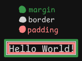
The elements bounds, or the border, is the white layer. This layer is the bounds that touch all of the other elements on your page. You can change how close each element is by increasing the outer layer, or the margin. This will give designated space between your elements. Lastly, is the padding, or the space between your content and the border of your element. At first this can be confusing, but the more you experiment with them the more comfortable you’ll feel using them.
You can modify each of them the way you would modify most things in CSS; calling them by their name. To change the border, modify the border-width classifier with thin, medium, or thick to get a browser-specified effect, or pass in your own values. You can also change the type of border you see, or the border-style. There are a few, you can find a whole list in the text. My favorites are dashed, groove, and ridge. You are also able to change just the top, bottom, and both sides of the border by calling it with border-side-style, and replace side with top, bottom, left, and right.
div {
	border-width: thick;
	border-style: groove;
	border-color: red green blue pink;
}
What makes CSS really cool sometimes, is that you can use shorthand to pass in multiple decisions at once, like the following;
p {
	border: 3px dotted #0088dd;
}
We can start to modify our padding in a similar fashion, without as much flair. We start by calling padding with some metric for how much space we want. Again, no reason not to use pixels. We can also call a specific side in the same way we can with borders. Same goes for margins, using the margin specifier.
p {
	width: 200px;
	border: 2px solid #0088dd;
	padding: 10px;
}
p.example {
	margin: 20px;
}
Centering Content
Rather than how you might think we’d center content, we’re going to use the skills we just learned to center content either on a page or within an element. The easiest way to center such a box would be to set the margin for that boxes left and right side to auto, like in the following example;
body {
	text-align: center;
}
p {
	width: 300px;
	padding: 50px;
	border: 20px solid ##0088dd;
}
p.example {
	margin: 10px auto 10px auto;
	text-align: left;
}
<body>
	<p>Analog synthesizers are often said to have a "warmer" sound than their digital counterparts</p>
	<p class="example">Analog synthesizers are often said to have a "warmer" sound than their digital counterparts</p>
</body>
Display
Another super common thing to change, we know by now that HTML likes to stack things right on top of one another. Well, how can we stop it from doing that? For example, most of the better websites and portfolios we view have a nav-bar on the top of the page, with all options usually in a horizontal line. We can make that happen easily, see the following example;
li {
	display: inline;
	margin-right: 10px;
}
You can also pass in inline-block, and block as options. Try them out and see what happens! A weird one I’ll leave this section with is setting the visibility attribute. Pass in hidden if you want to hide any elements on your page.
Summary
- Since each element lives within a box, we can make edits to said box to effect how each element interacts with one another
- Border, padding, and margin make up the surroundings of each element
- Change each attribute directly to make desired changes, but getting used to what happens requires practice
Next: Chapter 14